Statistical Short-term Forecasting of the COVID-19 Pandemic
*Corresponding Author(s):
Jurgen A DoornikNuffield College, Oxford, United Kingdom
Email:jurgen.doornik@nuffield.ox.ac.uk
Abstract
We have been publishing real-time forecasts of confirmed cases and deaths for COVID-19 from mid-March 2020 onwards, published at www.doornik.com/COVID-19. These forecasts are short-term statistical extrapolations of past and current data. They assume that the underlying trend is informative of short-term developments, without requiring other assumptions of how the SARS-CoV-2 virus is spreading, or whether preventative policies are effective. We provide an overview of the forecasting approach that we use and assess the quality of the forecasts in comparison to those from an epidemiological model.
Keywords
COVID-19; Data revision; Forecasting; Forecast evaluation; Interval forecasts; Scenario analysis; Seasonality
INTRODUCTION
The World Health Organization (WHO) was first notified of a cluster of cases of pneumonia in Wuhan, China on 31 December 2019. When the WHO declared COVID-19 as a pandemic on 11 March 2020, confirmed cases were just over 120000 worldwide, with about 4600 deaths. While cases had been detected in many countries, the largest clusters were then in China, Italy, Iran, and South Korea. By the start of October 2020 there have been 34 million confirmed cases and one million deaths.
The pandemic has already had massive impacts everywhere, far beyond the immediate health implications: the economic and political effects will be felt for some years to come. Not surprisingly, there has been an explosion of scientific research on the many aspects and consequences of the SARS-CoV-2 virus. Our contribution is the production of real-time forecasts for confirmed COVID-19 cases and deaths for many parts of the world on an almost daily basis.
The methodology is described in detail in our preceding paper, which also shows that those forecasts are more accurate than some other epidemiological models, at least during the exponential growth in COVID-19 cases in April 2020 [1]. The aim of this note is to provide an update of the model and extend the evaluation period up to the end of September. We first discuss the difference between scenario analysis and forecasting, which is not always clearly made in the epidemiological literature, and issues with the data. After that we outline the general methodology used to produce the statistical forecasts and to introduce seasonality into the model. Forecast results are then compared for accuracy.
METHODS AND DATA
The distinction between scenario analysis and forecasting is not always clear.
Scenarios
Mathematical models provide the framework for the epidemiological analysis. The classic model is the SIR model, where a population moves through the compartments susceptible (S), infectious (I), and removed (recovered or death R) [2]. Models can be built as largely (or purely) mathematical constructs, with a structure that tries to give a realistic reflection of the relevant environment, with parameters calibrated from previous experience, or given ‘plausible’ values. This type of model can be used for scenario analysis: to study how a change in a parameter affects the model outcomes. These scenarios allow us to contrast potential outcomes; an example that had a major impact on the policy response to COVID-19 in the UK [3]. A scenario tells us what could happen, not what is likely to happen. Their quality is determined by the quality of the assumptions, and it can be difficult to estimate the uncertainty of the scenario analysis in this setting. A scenario is sometimes called a projection, but we think this is ambiguous. When a ‘best-case scenario’ is presented, we interpret that as a forecast rather than a scenario.
Structural models
Learning from past experience requires bringing statistical methods to the mathematical model. For example, fitting an SIR model to a past epidemic, using data on population, mortality, and infections, can give estimates of the basic reproduction number R0 and the time varying reproduction number Rt, which is the average number of infections caused by an infected person. (Hethcote prefers to call it the replacement number, but that seems to be a lost cause) [2]. The reproduction number is not directly observed, but obtained from a model, which may contribute to the wide range of estimates we have seen. Moreover, there can be large regional variations. Interventions such as lockdowns and social distancing aim to influence the reproduction number. There is a wide range of models and statistical methods that can be used, but we argue that in all cases a good representation of the observed data is required: assumptions about statistical distributions can be checked, as can systematic departures. A good model is ‘congruent’ with the available information and can be obtained by different statistical approaches. The resulting models are often called ‘structural’ because they claim to be a simplified representation of the structure that generated the data. Learning about the structure increases knowledge about the real world. After estimation, the model can be used for scenario analysis by changing some parameters: to be valid requires that the structure is invariant to such a change.
Forecasts
A forecast is what our model considers to be the expected outcome of a quantity in the future. If the forecast is for an observed quantity, we can check later how far away the forecast was from the outcome. If the forecast is for an unobserved quantity, such as Rt, it is harder to check if that forecast was compatible with the outcomes. A structural model can be used for forecasting, provided it is closed (does not depend on, as yet unknown, future outcomes), or a closure is provided. A closed model generates a single ‘optimal’ forecast path, while that model could generate an infinite number of scenarios. There is ample evidence that forecast averaging, i.e. using several models and then taking the simple average (weighted averaging rarely seems to help), provides better forecasts, see e.g. many methods used in [4]. Unfortunately, there are no theoretical results to guide this averaging, and adding a ‘poisonous’ model to the mix can lead to worse forecasts.
When it comes to forecasting, it is also possible to use a pure time-series model, i.e. one that predicts the future purely from past trends. Examples include a simple autoregressive model, or an exponentially weighted moving average (EWMA) as used for global COVID-19 cases [5]. An EWMA leads to a straight-line forecast, which is not consistent with epidemiological theory, but may nonetheless be better over a short period of time. This can work, also in the epidemiological setting, because past cases reflect everything that has happened, including the recent reproduction numbers. In fact, in many forecast comparisons the simple time-series model is barely beaten, or not at all. The reason is that reality evolves in different ways from what models assume, and policy reactions can shift distributions suddenly in ways that can be difficult to model formally. If such shifts happen intermittently, robustness to these shocks can be more important than an ability to forecast well in quiescent periods.
Uncertainty of the forecasts is reflected through the reporting of interval forecasts, which estimates the expected distribution of the outcomes around the central forecast. We report 80% intervals, but 95% intervals are more commonly seen. Alternatively, the whole distribution can be given.
DATA
The availability of good data is of primary importance to any forecasting exercise. Ideally, we have timely and accurately measured observations on confirmed COVID-19 cases, deaths (properly identified by cause), and other aspects of the pandemic, based on unconstrained testing and using identical definitions in each locality. In practice, definitions and timeliness vary, and there are financial, technological, and capacity constraints. Moreover, the publication of data can become politicized, with economic or political reasons to obfuscate. As forecasters, we do not have the ability to collect or correct the data, so the forecasts are for the measurements in use at the time.
We use the data repository for the 2019 Novel Coronavirus Visual Dashboard operated by the Johns Hopkins University Center for Systems Science and Engineering (JH/CSSE). In our previous report we documented large revisions up to the end of April 2020. For the subsequent period up to early October, we find additional revisions in the data for European countries and US states.
- • Revision of most of the entire history of deaths in the UK, Sweden, New York, Michigan, Texas, and of confirmed cases in Sweden, Michigan;
- • Revision for a shorter number of days (of both deaths and confirmed for more than ten US states, and confirmed cases in France and Spain);
- • Sudden jumps, which may reflect a definitional change or a one-off adjustment for past errors;
- • Occasional negative counts of deaths or cases.
Figure 1 provides some examples. The left figure is for New York State, showing that the data released as of 29 May is more volatile up to that date than the one released as of 29 August. The release four days later again has a substantially lower count in April, but a sudden daily count above 4000 for 18 May (still present in the most recent release). Also marked in the small box at the bottom right of the first plot is a negative death count at the end of June. The right figure shows cumulative confirmed cases and daily increments for the UK. At the very end of the sample, the UK discovered 16000 cases that should have been reported during the week before. As a consequence, forecasts before 3 October are likely too low, and those made afterwards too high. But it seems unreasonable to blame the forecaster for that.
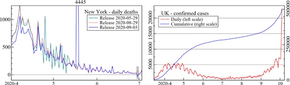 Figure 1: Three data releases for daily deaths New Yark State (left); sudden jumps in confirmed cases UK (right). Calendar dates on horizontal axis (5 marks start of may etc.).
All our forecasting relates to the cumulative counts of ‘confirmed’ and ‘deaths’ separately. The regions and countries for which we publish forecasts changes over time, based on our interests, subject to a minimum amount of 2000 confirmed cases or 200 deaths.
STATISTICAL ANALYSIS
We have reported statistical forecasts of cumulative confirmed COVID-19 cases and deaths on www.doornik.com/COVID-19 for many countries in the world from mid-March 2020 onwards. The forecasts are obtained from an extrapolative time-series model, rather than a structural epidemiological model [1]. Here we only provide a general description of the modeling approach, followed by a discussion of the introduction of ‘seasonality’ into the model.
The methodology to construct the robust forecasts involves several steps. First, we take cumulative confirmed cases and deaths and decompose the observed daily time series into an underlying flexible trend and a remainder term, assuming there is no seasonality. This trend is estimated by taking moving windows of the data and saturating these by segments of linear trends. Selection from these linear trends is made with an econometric machine learning algorithm, and the selected subset estimates are then averaged to give the overall flexible trend [6]. Next, the trend and remainder terms are forecast separately using our ‘Cardt’ method [7,8] and recombined in a final forecast.
Forecasts are produced for more than 50 countries, states of the US, as well as more than 300 administrative regions of England. The same approach is used for all of these: it would be too much work to tailor the model for every case. Instead, we provide two forecasts:
- The first is the forecast that comes out of our modeling approach, which, through Cardt, is already an average of three forecasts. We refer to this as F.
- The second is an average of forecasts from two model specifications, with forecasting starting today, yesterday, and the two days before that. This is an average of 8 forecasts (but those starting in the past are adapted to the last known value). This is labelled Avg, and note that F is one of the eight.
Often, F and Avg are close together. If not, it indicates a more rapid acceleration or deceleration than expected from recent runs of the model.
Seasonality
Seasonality here refers to the regular variations in the observed data that follow a calendar pattern. For example, the demand for electricity has a daily seasonality, with different demand in the weekend from the weekday. But it also has a monthly pattern with different demand in summer from winter. The seasonal pattern of influenza-like illnesses is predominantly seasonal: they mainly occur in winter, but the precise occurrence of the winter peak is not a fixed calendar event (indeed this year is different, with WHO Influenza update 377 reporting that ‘Despite continued or even increased testing for influenza in some countries in the southern hemisphere, very few influenza detections were reported’).
At the start of modeling in March 2020, we did not see seasonality in the data, nor expected it to be relevant (neither did any other model as far as we are aware) [5]. However, it was found subsequently that some countries exhibit pronounced seasonality, as Figure 2 shows for the UK. From 19 April (a Sunday) onwards, a reporting low in confirmed cases as well as deaths is firmly established for Sunday, with a mid-week peak. Saturday also has low reporting of confirmed cases, but Monday for deaths. From the end of June, this pattern is disturbed. Many other countries also show such weekly seasonality, not necessarily in confirmed cases and deaths at the same time.
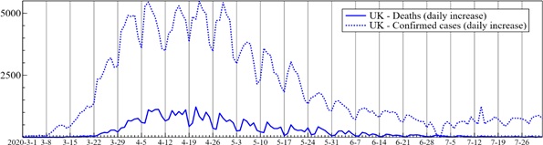 Figure 2: Daily reported counts of confirmed cases and deaths in the UK (JHU/CSSE data and dates). March 1st2020 is written as 2020-3-1, a Sunday.
There can be many reasons for a day of the week effect. Institutional reasons can mean that fewer tests are processed in the weekend, or that recording is partially delayed until after the weekend. Such effects have been established in other setting: a study of 14 million hospital admissions in the English National Health Service (NHS) in 2009/10, concluded that patients were less likely to die in the weekend than midweek [9,10].
We handle seasonality by adding to the initial model (this change was made on 2020-07-01):
- • Six indicator variables for six days of the week;
- • Both a weekly sine and cosine wave, and a half-weekly sine and cosine wave.
The redundancy in these factors is resolved by model selection, only retaining significant seasonal terms. The moving estimation window approach allows the model to capture changing seasonality. For forecasting purposes, the seasonality at the end of the sample is extrapolated into the future.
Estimates of the peak
It is useful to know if the peak in daily confirmed cases is behind us, showing that progress is made in containing the virus. For deaths, it signals a reduction in pressure on hospitals’ intensive-care units. And there is much concern about a second wave, which would correspond to a second peak. It can be difficult to date the peak even much afterwards, as Figure 2 illustrates for both deaths and confirmed cases: it is sometime in April. Seasonality matters too: while the peak in the actual data will be mid-week, this need not be the case for estimates of the underlying trend.
We base the peak on the average of the eight smooth underlying trends, the same as are used in the production of the Avg forecast. As we do this in real-time, some heuristics is added to only call a peak after some delay. Nonetheless, sometimes we call a peak too early, and at times it shifts as more information accrues or the data is revised.
Figure 3 shows some examples of the smoothed estimates of the underlying trend. The first two graphs are for deaths in New York State, the next two for the UK. The first NY graph compares two of the same data releases that were shown in Figure 1. The next graph displays the daily counts implied by these trends, i.e. the first difference of the smooth trend. The daily counts are noisier, as expected (the change in daily counts would be noisier still). A notable feature of our procedure is that it does not smooth over the jump, instead this is maintained as such, which seems appropriate here. However, any recent estimates of the peak would put it on 18 May, even though this does not seem genuine.
The next two graphs in Figure 3 show the equivalent time series for the UK, now both without seasonality in the model (the solid line), and with (the dashed line). The difference cannot be discerned by the eye in the cumulative plot, but the solid line shows some remnants of seasonality in the daily death count and has the peak a day earlier and lower.
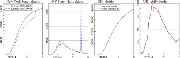
Figure 3: Estimated trends in deaths, New York State (left: cumulative and daily deaths); UK (right: cumulative and daily deaths).
RESULTS AND DISCUSSION
We assess forecast performance for Europe and the United States, comparing the forecasts F and Avg from our models to those given by Los Alamos National Laboratory (LANL, covid-19.bsvgateway.org). Focus is on short-term forecasting, up to one week ahead.
Evaluation is based on the mean absolute percentage forecast error (MAPE). A forecast fj,T+h at horizon h starting from the last observation at T for group j=1,...,J has a forecast error uj,T+h= yj,T+h−fj,T+h, and (note that yj,T+h>0 here)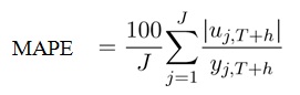 So yj,T refers to the last known cumulative confirmed cases or deaths for area j.
For a fair comparison we:
- only compare forecasts starting after the same day T for the same area j and with the same target horizon h;
- use the first available outcome for day T + h;
- use the outcome as reported by the forecaster.
Tables 1 and 2 give the MAPE of the forecast errors from one to seven days ahead for our forecasts F and Avg of cumulative confirmed cases and cumulative deaths, as well as those of the LANL model. For European countries, Table 1 shows that deaths are a bit more accurately predicted than confirmed cases, and LANL is somewhat more accurate for the latter, and less for the former. The results reconfirm our previous reporting that the average forecast tends to outperform the individual F for deaths, but not for confirmed. The better performance that our forecasts had in April for deaths in the US, also reported in [1], has largely disappeared.
|
|
Confirmed |
Deaths |
||||
|
h |
LANL |
F |
Avg |
LANL |
F |
Avg |
|
1 |
0.4 |
0.5 |
0.5 |
0.4 |
0.3 |
0.3 |
|
2 |
0.7 |
0.8 |
0.8 |
0.6 |
0.5 |
0.5 |
|
3 |
0.9 |
1.0 |
1.1 |
0.8 |
0.7 |
0.7 |
|
4 |
1.1 |
1.3 |
1.3 |
1.0 |
0.9 |
0.8 |
|
5 |
1.3 |
1.6 |
1.6 |
1.2 |
1.1 |
1.0 |
|
6 |
1.6 |
1.8 |
1.9 |
1.3 |
1.2 |
1.1 |
|
7 |
1.8 |
2.1 |
2.2 |
1.4 |
1.4 |
1.3 |
Table 1: MAPE of forecasts for 23 European countries at forecast horizons h. There are 764 forecast errors at each horizon for confirmed, and 465 for deaths. Period 2020-04-29 to 2020-09-23.
|
|
Confirmed |
Deaths |
||||
|
h |
LANL |
F |
Avg |
LANL |
F |
Avg |
|
1 |
0.5 |
0.6 |
0.6 |
0.6 |
0.6 |
0.6 |
|
2 |
0.8 |
1.0 |
0.9 |
0.9 |
0.9 |
1.0 |
|
3 |
1.1 |
1.4 |
1.3 |
1.1 |
1.2 |
1.2 |
|
4 |
1.3 |
1.7 |
1.5 |
1.3 |
1.4 |
1.3 |
|
5 |
1.6 |
2.1 |
1.8 |
1.5 |
1.7 |
1.5 |
|
6 |
1.8 |
2.5 |
2.2 |
1.8 |
2.0 |
1.8 |
|
7 |
2.1 |
2.8 |
2.5 |
2.0 |
2.2 |
2.0 |
Table 2: MAPE of forecasts for 50 US States at forecast horizons h. There are 1665 forecast errors at each horizon for confirmed, and 1234 for deaths. Period 2020-05-11 to 2020-09-23.
Table 3 reports the coverage of the interval forecasts: the percentage of outcomes that are within the quoted 80% intervals. A perfectly calibrated interval would show a value of 80 in each cell. We see, however, that the intervals from the LANL model are too small at the very short horizons, while ours are too wide initially.
|
|
Confirmed |
Deaths |
||||||
|
|
LANL |
F |
LANL |
F |
||||
|
h |
EU |
US |
EU |
US |
EU |
US |
EU |
US |
|
1 |
64 |
64 |
88 |
89 |
69 |
52 |
95 |
91 |
|
2 |
66 |
71 |
85 |
86 |
72 |
68 |
94 |
89 |
|
3 |
71 |
74 |
81 |
82 |
75 |
72 |
94 |
86 |
|
4 |
74 |
78 |
79 |
79 |
74 |
76 |
92 |
86 |
|
5 |
76 |
82 |
76 |
78 |
75 |
78 |
91 |
84 |
|
6 |
77 |
83 |
74 |
76 |
76 |
77 |
89 |
82 |
|
7 |
77 |
84 |
72 |
75 |
77 |
80 |
89 |
80 |
Table 3: Coverage percentage of interval forecasts for 23 European countries and 50 US States at forecast horizons h.
CONCLUSION
Accurate short-term forecasts of the COVID-19 pandemic are invaluable, providing policy makers with advance warnings, helping to allocate scarce public health resources and guide lockdown policy. We started producing real-time forecasts of COVID-19 from mid-March 2020 for many countries with the aim of addressing this need.
All forecasting models have different underlying assumptions and different ways of using past data. While models based on well-established theoretical understanding and available evidence are crucial to viable policy making in observational-data disciplines, shifts in distributions can lead to systematic mis-forecasting. Consequently, there is an important role for short-term forecasts using adaptive data-based models that are robust after distributional shifts. Flexible, data-based models can also be useful in monitoring if a peak in daily cases has been reached.
We gave several examples of the data problems that forecasters face, and have shown that seasonality within the week matters, but in a way that changes over time. A comparison of accuracy with the LANL model over the period May-September 2020, shows little difference with our forecasts in terms of MAPE, perhaps giving a small edge to LANL.
An advantage of our data-based approach is that forecasting models are quicker to make and run than structural models. From the end of June 2020 we have added forecasts for more than 300 lower tier local authorities in England. Our models do not help in understanding what has happened: this is the role of epidemiological models. But they do help with forecasting, especially in the early stages of a pandemic.
ACKNOWLEDGEMENTS
Financial support from the Robertson Foundation (award 9907422), Institute for New Economic Thinking (grant 20029822), and the ERC (grant 694262, Dis Cont) is gratefully acknowledged.
REFERENCES
- Doornik JA, Castle JL, Hendry DF (2020) Short-term forecasting of the coronavirus pandemic. International Journal of Forecasting.
- Hethcote HW (2000) The mathematics of infectious diseases. SIAM Review 42: 599-653.
- Ferguson NM, Laydon D, Nedjati-Gilani G, Imai N, Ainslie K, et al. (2020) Impact of non-pharmaceutical interventions (NPIs) to reduce COVID-19 mortality and healthcare demand. Discussion paper (16 March 2020), MRC Centre for Global Infectious Disease Analysis.
- Makridakis S, Spiliotis E, Assimakopoulos V (2020) The M4 competition: 100,000 time series and 61 forecasting methods. International Journal of Forecasting 36: 54-74.
- Petropoulos F, Makridakis S (2020) Forecasting the novel coronavirus COVID-19. Plos One 15.
- Doornik JA (2009) Autometrics. In Castle JL, Shephard N (Eds.), TheMethodology and Practice of Econometrics: Festschrift in Honour of David F. Hendry. Oxford: Oxford University Press.
- Doornik JA, Castle JL, Hendry DF (2020) Card forecasts for M4. International Journal of Forecasting 36: 129-134.
- Castle JL, Doornik JA, Hendry DF (2019) Some forecasting principles from the M4 competition. Economics discussion paper 2019-W01, Nuffield College, University of Oxford.
- Freemantle N, Richardson M, Wood J, RayD, Khosla S, et al. (2012) Weekend hospitalization and additional risk of death: An analysis of inpatient data. Journal of the Royal Society of Medicine 105: 74-84.
- Dong E, Du H, Gardner L (2020) An interactive web-based dashboard to track COVID-19 in real time. The Lancet Infectious Diseases 20: 533-534.
Citation: Doornik JA, Castle JL, Hendry DF (2020) Statistical Short-term Forecasting of the COVID-19 Pandemic. J Clin Immunol Immunother 6: 046.
Copyright: © 2020 Jurgen A Doornik, et al. This is an open-access article distributed under the terms of the Creative Commons Attribution License, which permits unrestricted use, distribution, and reproduction in any medium, provided the original author and source are credited.